“We decided that we only needed an update and not a full redesign.”
Facebook has recently made some understated changes to its decade-old iconic logo.
The subtle tweaks are worthy of a ‘spot the difference’ puzzle. So why bother changing them at all?
Facebook’s Creative Director, Josh Higgins, said the social media giant wanted the new logo to look more ‘friendly and approachable’.
He added: “While we explored many directions, ultimately we decided that we only needed an update and not a full redesign.”
So what exactly have been altered in the new logo?
In typical brainteaser fashion, here are the answers:
- Letters are thinner
- More white space is visible
- The curve on the ‘a’ has been removed
- The ‘b’ has been given a more distinct stem
- Edges are much sharper overall with increased width
It was also rather odd that Facebook’s product designer revealed the new logo via his company’s rival – Twitter.
Say hello to the new Facebook logo pic.twitter.com/ofoFm4JQmK
— Christophe Tauziet (@ChrisTauziet) June 30, 2015
As this logo is barely used on the website, the real reason to streamline the fonts is most likely to stand out on mobile devices.
It is believed more than 85 per cent of the 1.44 billion Facebook users who log on every month do so using their mobile phones.
Of the £2.13 billion advertising revenue raised in the first quarter of 2015, 73 per cent came from adverts shown on smartphones.
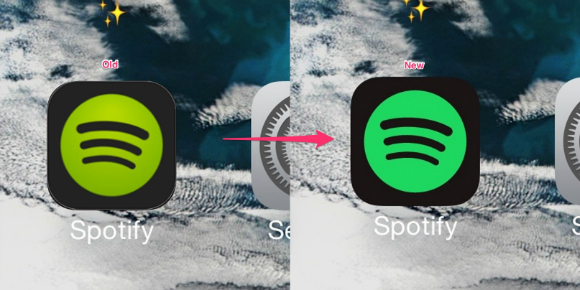 Facebook, however, is not the only social media to have made such undramatic modifications to their logo.
Let’s hope its users will not be as enraged by the changes as much as Spotify users at the new shade of green .
Whilst Facebook is also looking to make changes to their corporate logo, the famous ‘f’ also known as the favicon appearing in the upper left corner of the website is to remain unchanged…for now.


